Not Picasso Web App Redesign
Friday, November 15, 2024 to Saturday, March 22, 2025
Figma, Miro, Google Drive
From Discovery to Design, I facilitated this project on my own.
UX Researcher: Synthesized Secondary and Primary Research, conducted interviews.
UX Designer: Created User Flows, Wireframes, and Prototyped Mockups.

Introduction
This case study documents the full design process of one User Flow for an e-commerce website. Many e-commerce websites find that visitors add items to their cart without completing their purchase. The goal is to increase the conversion rate, turning regular site visitors or “window shoppers” to customers.
The Problem
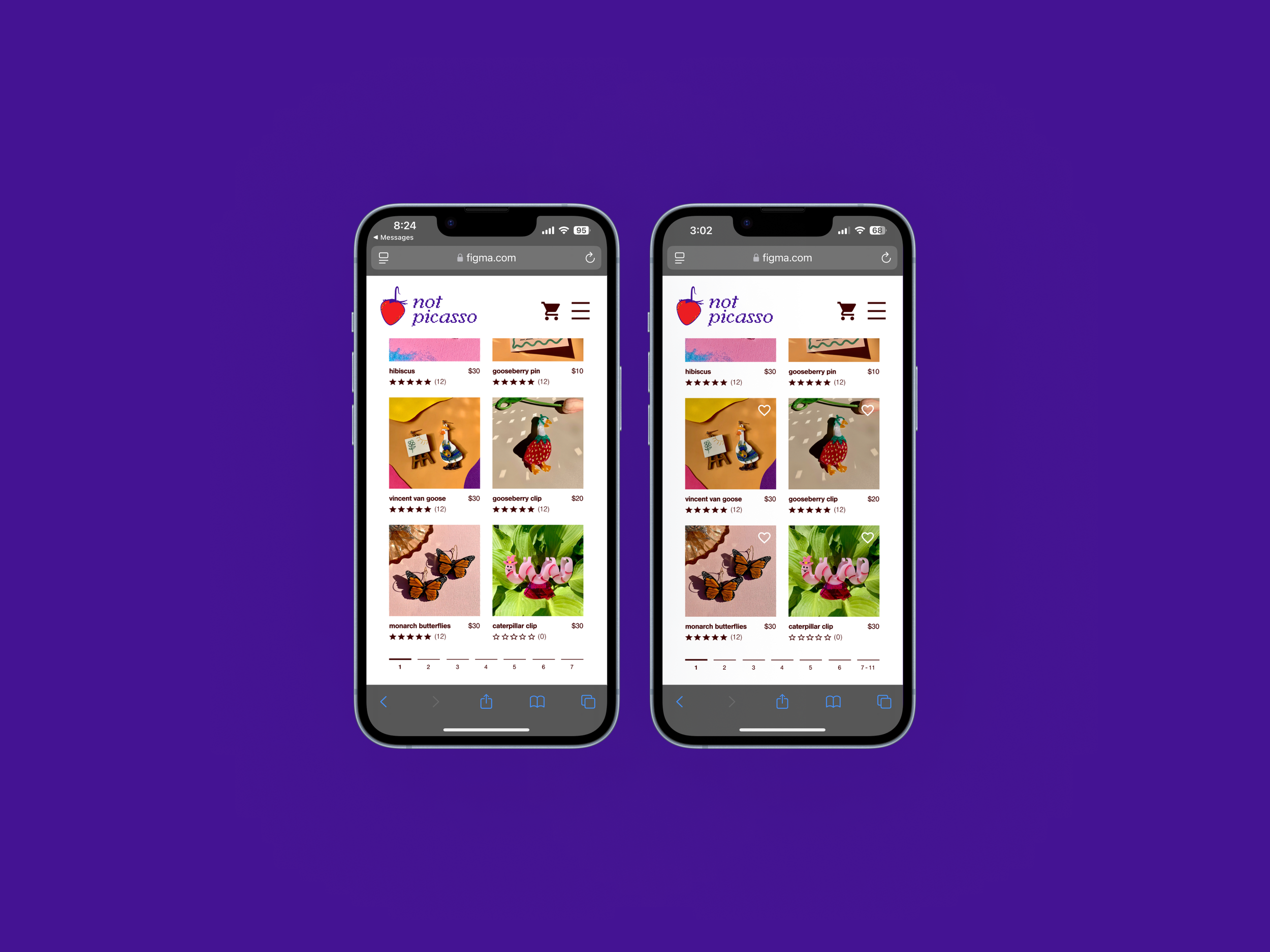
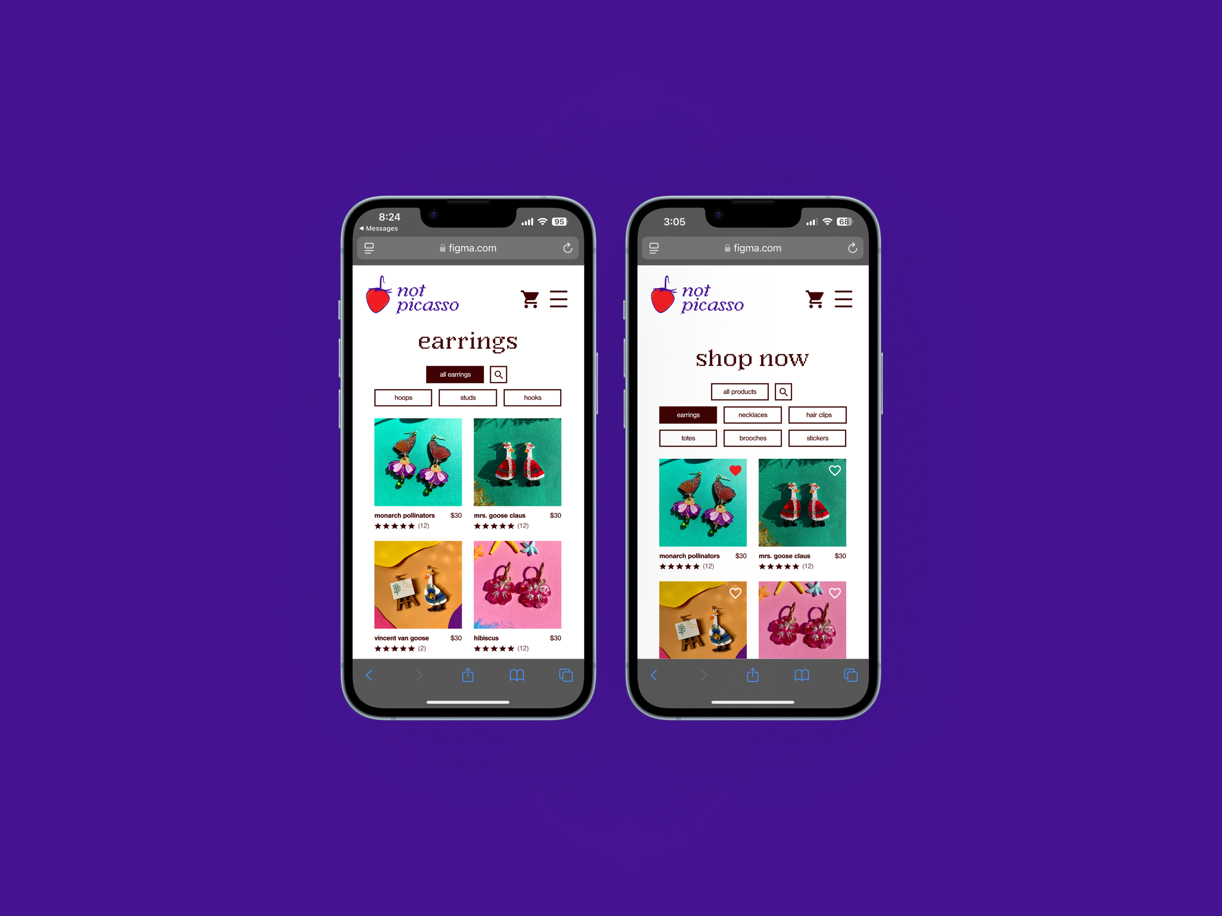
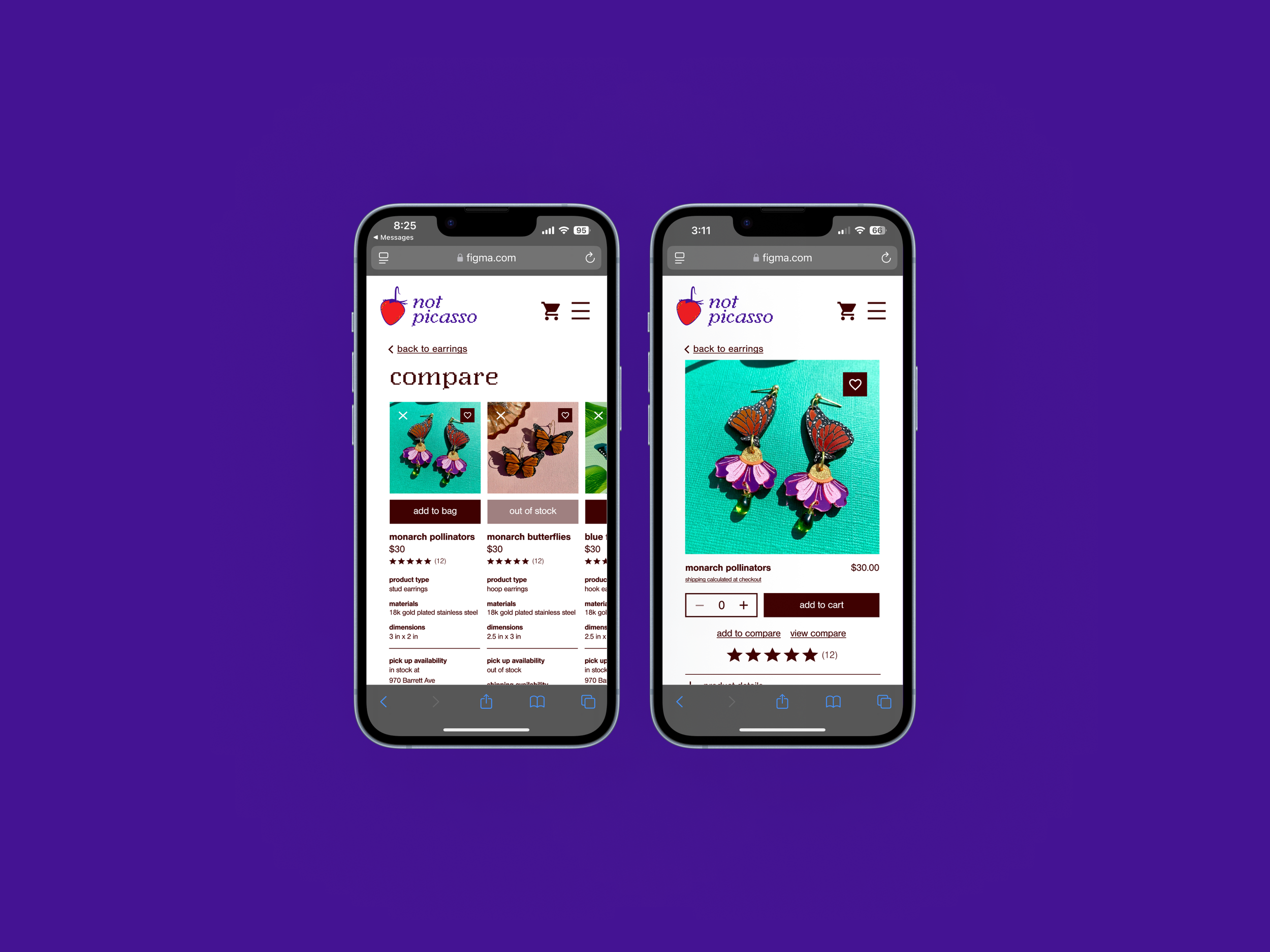
E-commerce sites have one goal, which is to convert a user into a customer. Users need the ability to choose how they view items and deserve the ability to compare and contrast features as they would in person. Not Picasso is a new small business selling earrings and other accessories. They are trying to meet the e-commerce needs of their audience. Their current user experience limits the ways users can compare products and view product groupings. These issues might prevent some users from becoming customers.
The Solution
The Not Picasso team wants to upgrade their current website. Their main goals are to maximize the amount of products a user can see, create a compare page and add to compare functions in product pages, and add a guest checkout option to their page.
The Constraints and Caveats
While the timeline was originally constructed to take place over the course of a month, from November 15 to December 28, the project only ended on Saturday, March 22. While each section was finished in the set amount of time, other life and work commitments made it difficult to complete each task with no breaks.
Not all components of the solution are fully required by the Not Picasso team. The guest checkout option is required by the Capstone 2 assignment. Guest checkout is available at www.shopnotpicasso.com.
As I designed the e-commerce site, I realized how many “logic” options I needed to create in Figma. The free version of Figma does not allow users to prototype conditionally, which makes it difficult to map out a web-app that has many options. This is an issue I encountered previously when I designed the Pollinate App, but I did not know about this function in Figma at that time.

wireframes
responses to feedback and changes
As I evaluated the feasibility of some of the feedback points, I found some were more difficult to accommodate than others. I wanted to make as many changes as I could, but some edits required a larger commitment than my original evaluation. In addition to omitting some changes, I failed to include feedback from my mentor in my affinity map. Points of feedback included removing the blue section of the footer, accommodating pagination for a maximum number of pages, and making the image opacities darker when they appear with text overlays.

Reflection
While creating the NotPicasso web app, I combined the requirements of a certification project with my objective to redesign a local business’s website. I knew that some requirements were irrelevant to my personal redesign goals, but I also knew that the assignment would guide my redesign in the right direction. Adding a compare page was a requirement in the assignment, but I made it fit within the context of the web app. For future projects, I will try to pose constraints similar to a UX assignment’s structure. I am a better designer when I have more constraints rather than unlimited freedom.
The old NotPicasso web app was incredibly outdated. Their poor branding scheme and accessibility prompted me to redesign their assets. If I propose the redesign to the small business owners, I will recommend that they change their design elements for better accessibility purposes.
Before I received feedback, the original state of the web app made me think that perfectionism was not necessary here. Rather, I needed to make the web app viable for a mobile version and then find issues that I could address in the long term. However, this mindset changed as I moved through the project.
As I conducted the user testing interviews, I had a difficult time differentiating what feedback directly critiqued the user flow and what feedback stemmed from users’ frustration when they could not use the full web app. This led to many difficulties with prioritizing edits. I should have listened to the user feedback, but at the same time understood that I did not need to address every point of critique. My innate drive for perfection pushed me to resolve all criticism. In the future, I will put my ego aside and accept that my work cannot be perfected in such a short timeframe.
Over time, I will create a “Compare” page that allows users to analyze more than three items at once. I will also refine certain paths if I choose to expand the app design beyond this single user flow. Currently, this iteration fulfills the businesses’ needs and will help them increase their conversion rate as an e-commerce site.